Quick Fit Check: Is White Oak Cabinets Right for You?
Best for
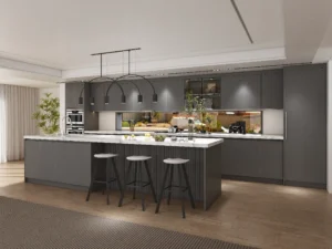
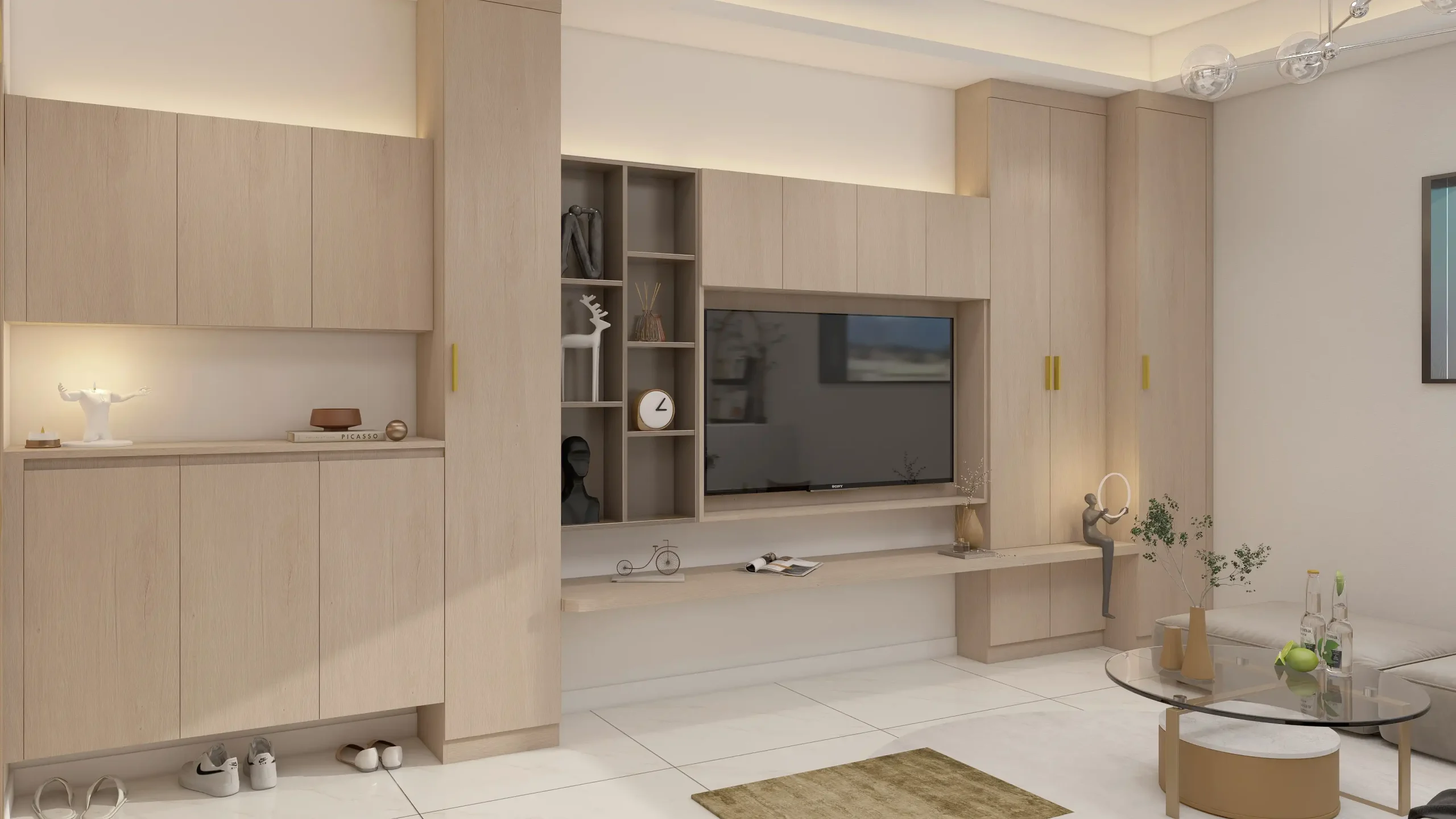
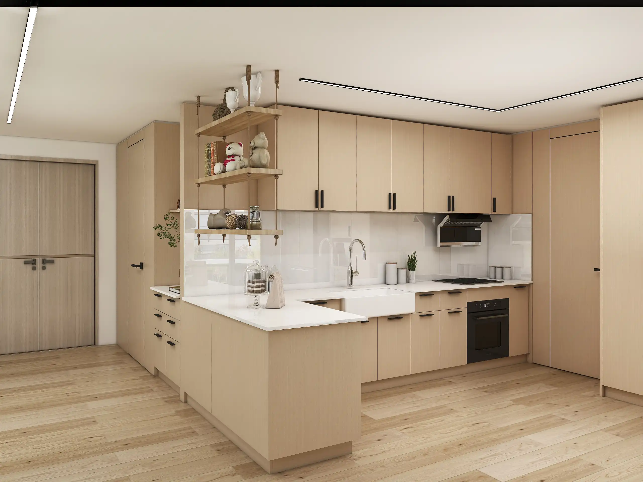
Warm-modern or Japandi kitchens that need texture without visual noise
Heavy-use spaces that still want a natural look (with a durable finish)
Low-maintenance owners who can commit to simple weekly wipe-downs
Consider something else if
You want perfectly uniform color (pure neutral—no warm shift)
You dislike visible grain or tone variation between doors
Budget is tight for rift/quarter cuts or specialty finishes
60-second decision grid
| Factor | If this sounds like you… | Recommendation |
|---|---|---|
| Grain look | Prefer straight, calm lines | White oak (rift/quarter) ✅ |
| Color stability | Want zero yellowing over time | Consider painted/maple |
| Cleaning habit | Quick weekly wipe is fine | White oak ✅ |
| Budget | OK with premium faces | White oak (select + veneer mixes) ✅ |
| Project type | Rental/flip, hard wear | Consider textured laminate/ash |

What “White Oak” Really Means (Species, Cuts, Grades)
Cuts at a glance
| Cut | Look | Stability | Cost & Lead-Time | Best Use |
|---|---|---|---|---|
| Rift-sawn | Very straight, calm grain | ★★★★ | $$$ · often longer lead | Modern, minimal fronts, tall panels |
| Quarter-sawn | Straight with ray fleck | ★★★★ | $$–$$$ | Transitional, artisan vibe, doors/drawers |
| Plain-sawn | Cathedral (arched) grain | ★★ | $ (fastest) | Rustic/cozy looks, islands, inserts |
Veneer vs. Solid (quick rule)
Choose Veneer when you need uniformity across long runs, tall doors, and panels; better yield, stable cores, easier color matching.
Choose Solid when you want refinishability and ding repair on framed doors/edges; great for small components and trim.
Grades & Grain-Matching (for consistent tone)
Grade: “Select/Prime” = fewer knots & straighter grain; “Character” = knots, color swing.
Matching:
Bookmatch → mirrored V rhythm (calm if grain is straight).
Slipmatch → linear, no “butterfly” effect (best for minimalism).
Sequenced sets → doors/panels pulled in order for smooth tone flow.
Why do samples look different at install?
Different cut/grade than the sample, non-sequenced veneer, or a finish sheened differently.
Lighting shift (showroom 4000–5000K vs. home 2700–3000K) and UV exposure.
Fix it upfront: specify cut + grade, match type (book/slip), sequenced sets, finish system + sheen, and approve a control door under both daylight & warm LED.
Color Pairing Roadmaps

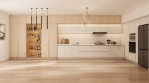
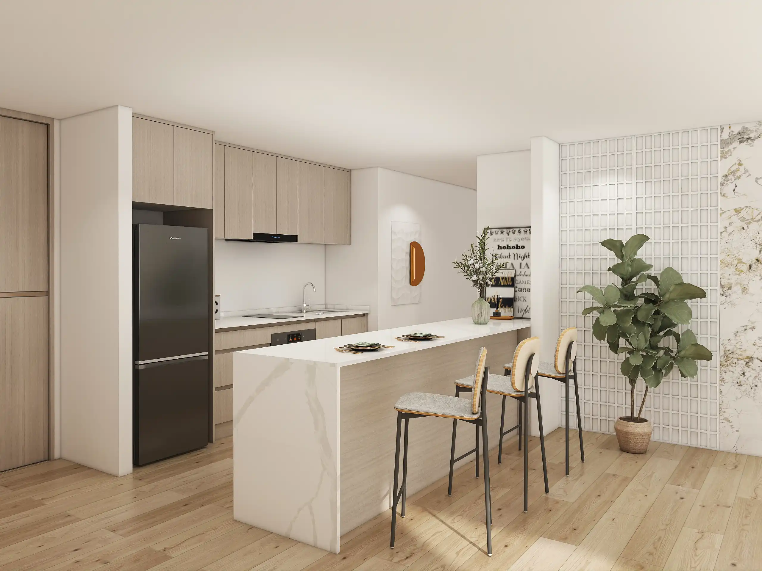
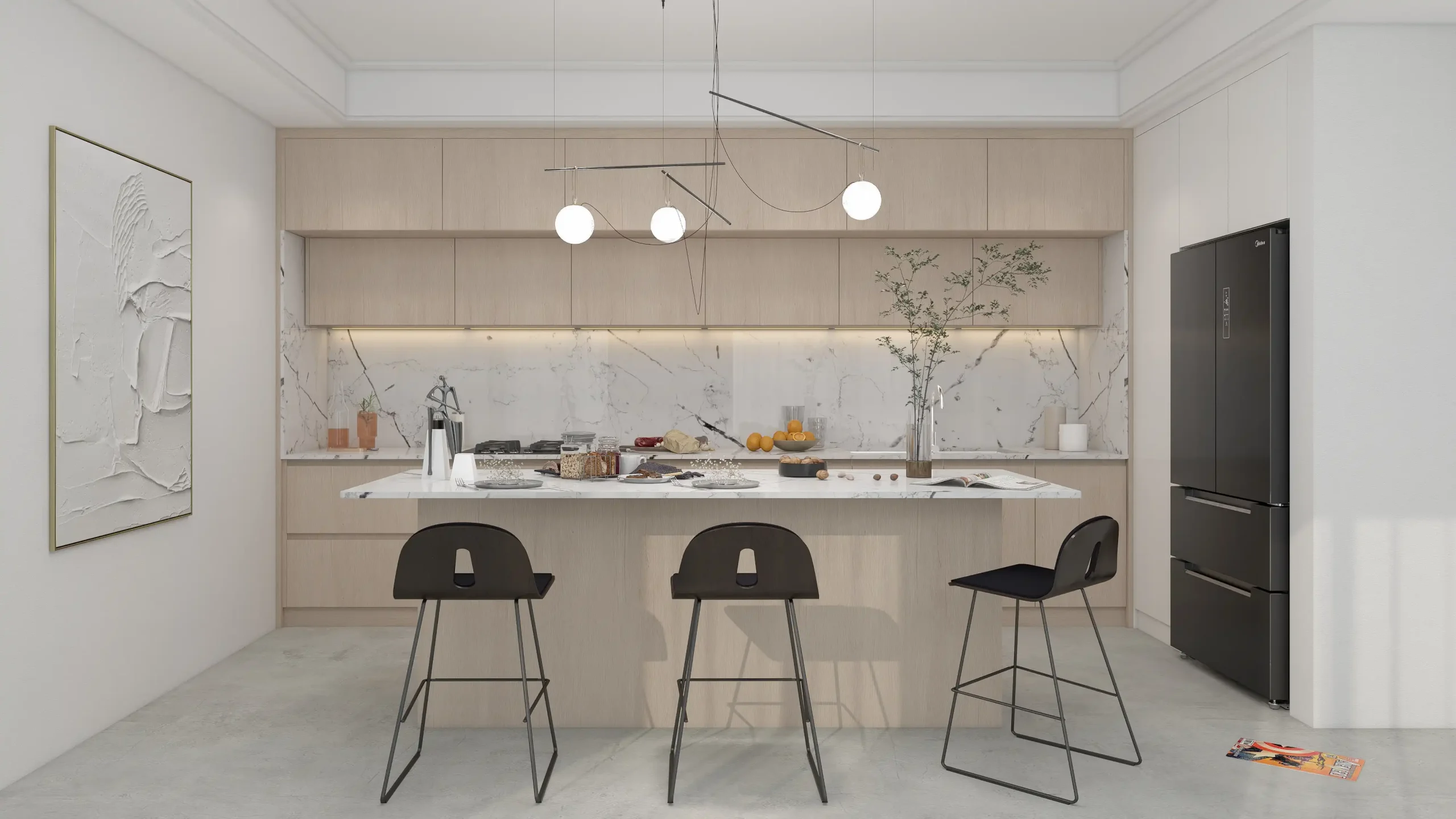
Organic Modern
Cabinet: rift white oak, waterborne non-ambering finish, Japandi Style
Counter: off-white quartz (subtle gray cast)
Metal: brushed nickel or matte black (keep one metal)
Walls: soft white with neutral undertone
Lighting: 3000–3500K, high CRI
Backsplash: slab to shelf, minimal veining

Warm Minimalist
Cabinet: limed/cerused white oak (matte)
Counter: micro-veined warm white or very light beige
Metal: warm brushed brass (limited accents)
Walls: warm off-white (no yellow bias)
Lighting: 3000K high CRI, diffused
Backsplash: honed limestone or tumbled zellige (light grout)

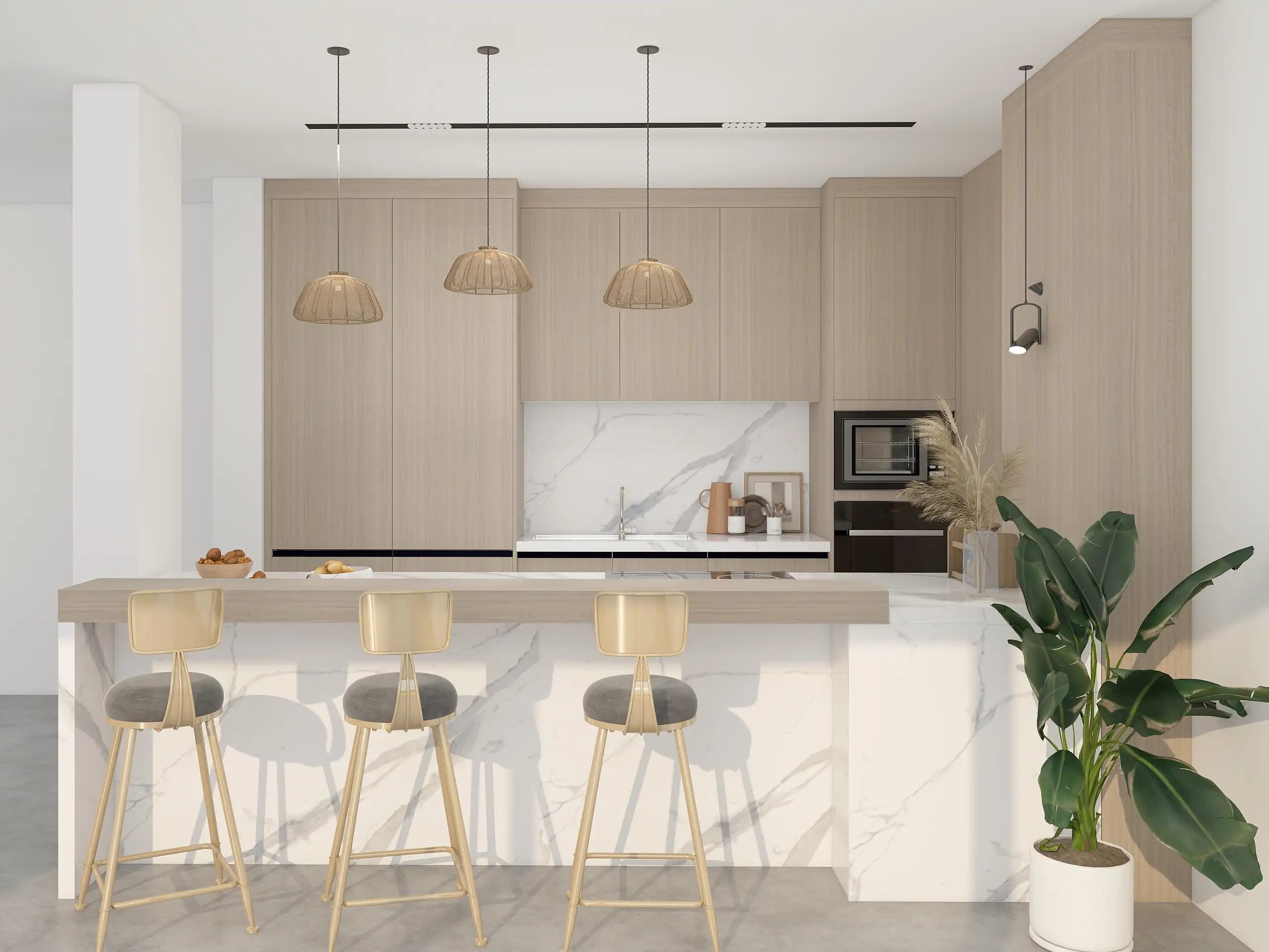
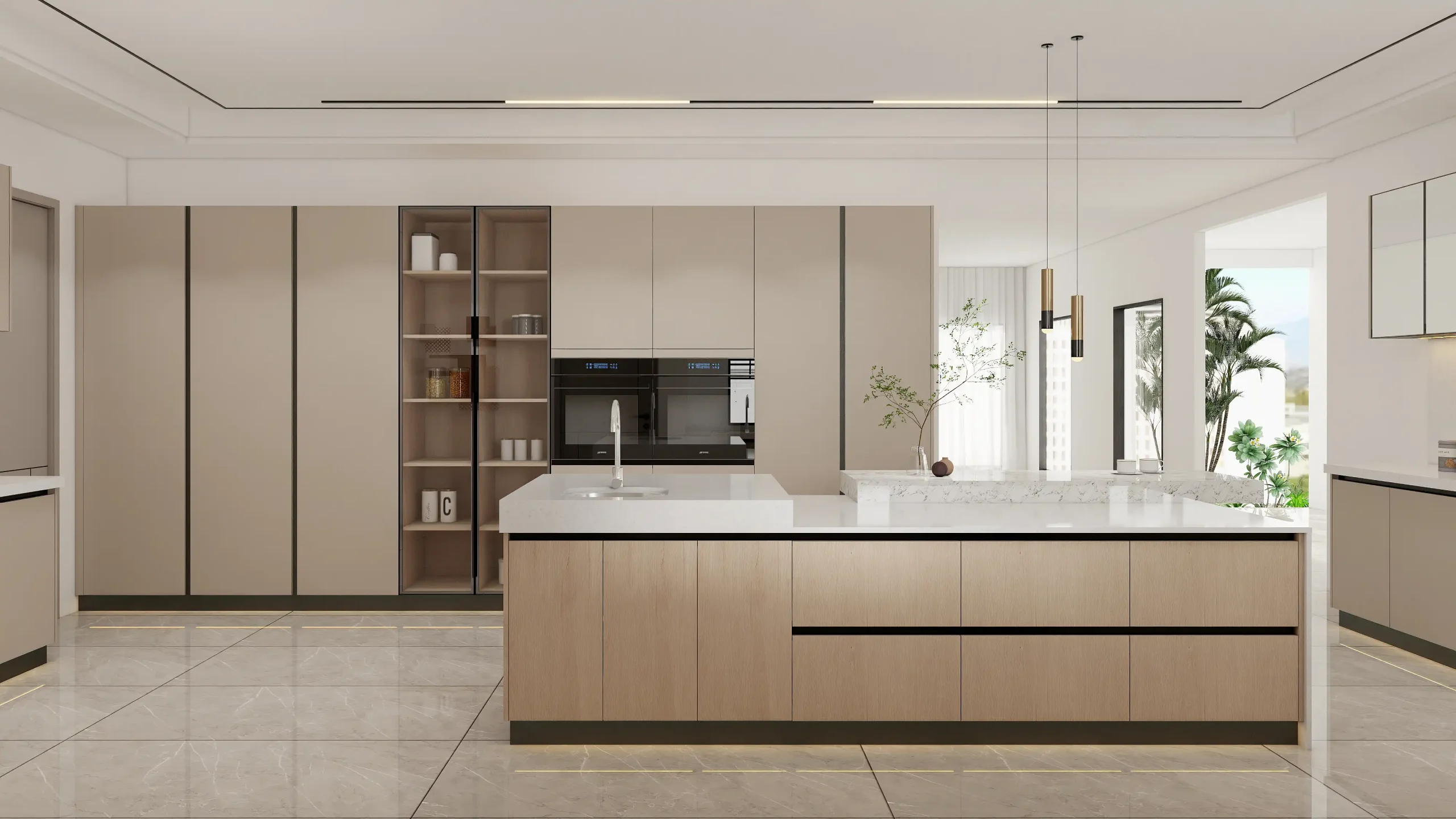
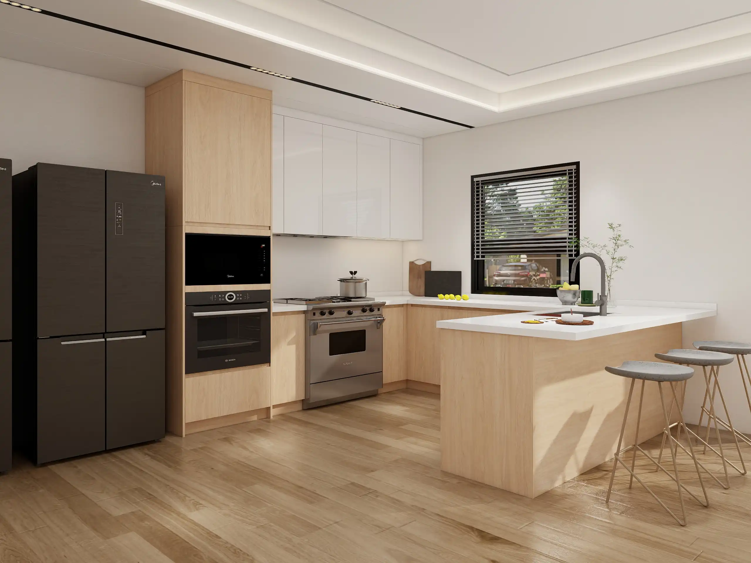
Transitional
Cabinet: medium-tone white oak (light whitewash to calm warmth)
Counter: marble-look quartz (soft gray vein)
Metal: polished nickel (timeless)
Walls: classic ivory with a touch of gray
Lighting: 3000–3500K layered (pendants + under-cabinet)
Backsplash: stacked marble mosaic or calm subway

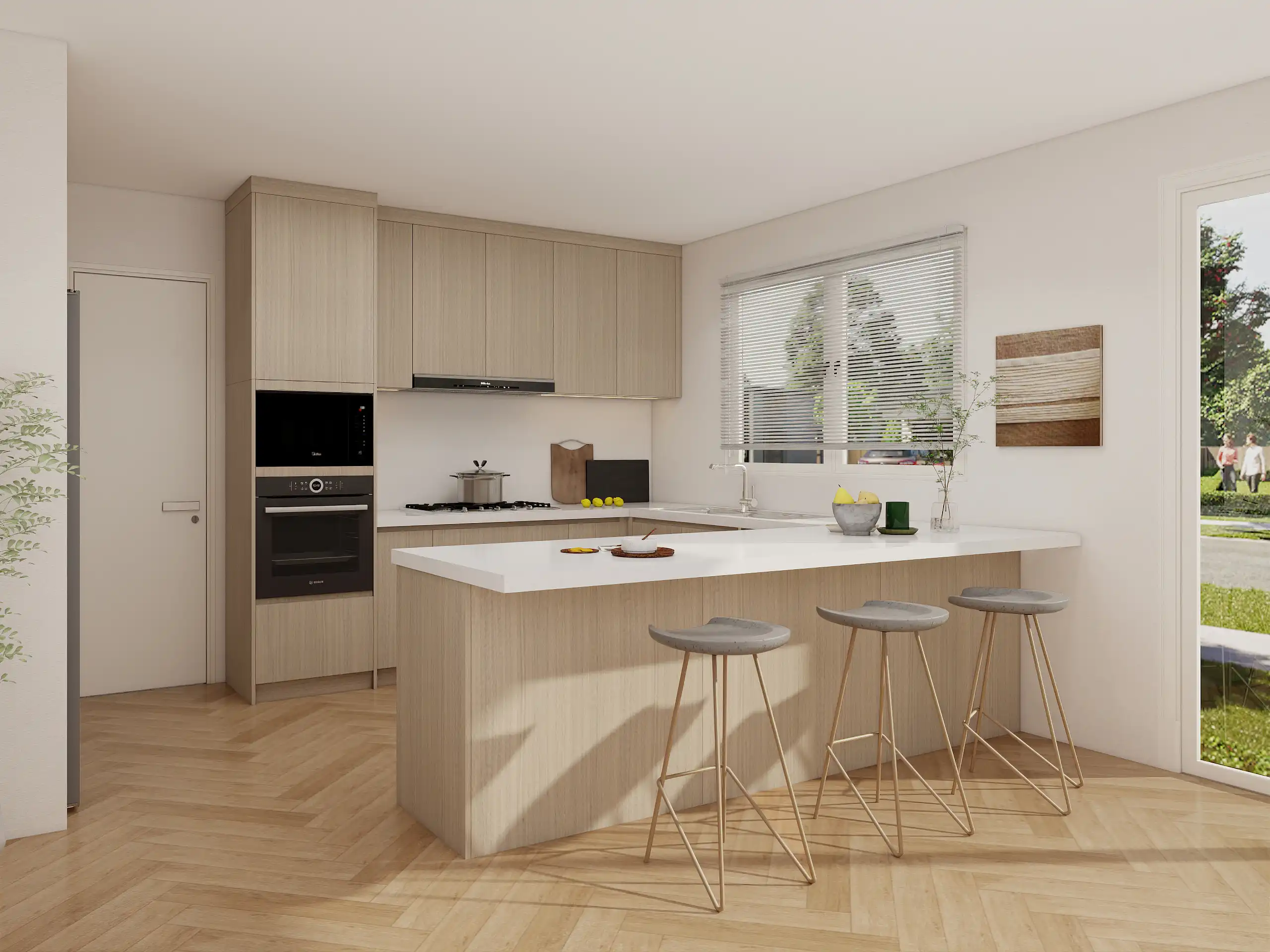
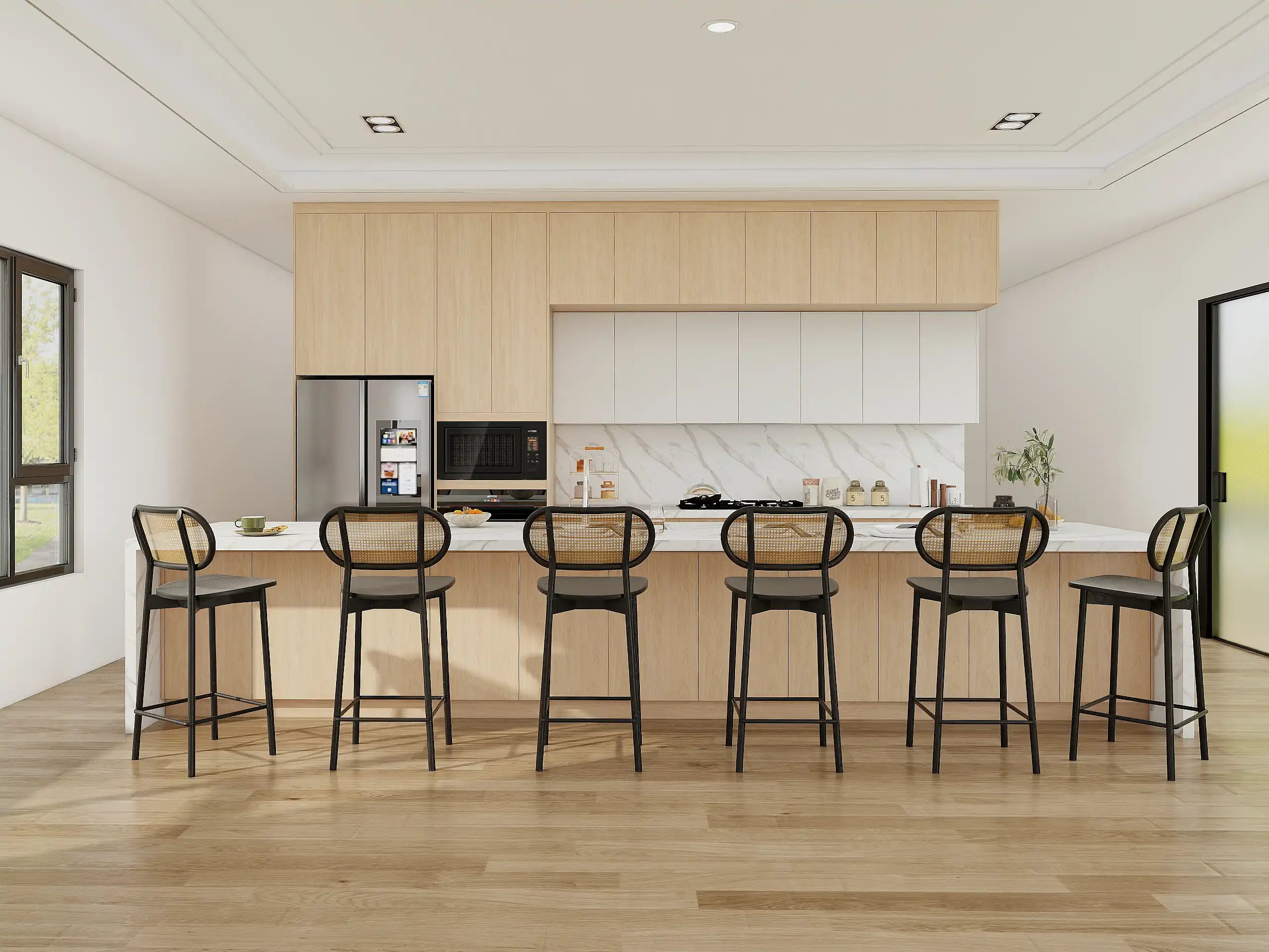
Small Kitchens (scale + brightness first)
Grain: vertical on tall doors to elongate
Floors: light, neutral oak or pale porcelain
Counter: high-light-reflectance off-white
Hardware: slim black or nickel
Lighting: continuous under-cabinet + ceiling wash; glass uppers or no uppers on one wall
Keep it warm—not yellow or muddy (quick rules)
Choose neutral or slightly cool counters to balance oak’s warmth.
Specify non-yellowing waterborne topcoat; add a subtle whitewash if needed (5–10%).
Lock LEDs at 3000–3500K, high CRI; avoid amber bulbs over wood.
Prefer matte/satin sheens to reduce orange cast and fingerprints.
Limit warm brass to small accents; pair with a neutral paint, not creamy yellow.

Design Moves to Avoid the “Time-Stamp” Look
Evergreen door styles
Slim-rail Shaker (≈2.25–2.5″ rails): classic lines, modern proportions.
Slab + micro-bevel (≈0.5–1 mm): crisp shadow, edges stay clean.
Integrated pulls (C-channel or edge pulls): fewer add-on trends to age out.
Wood coverage rule (10/30/60)
10% feature wood (island faces or tall pantry run)
30% supporting wood (select lowers or one wall)
60% painted/stone/metal to visually lighten
→ Keeps oak present but not overpowering.
Mixes that stay current
Painted island + white-oak perimeter for balance.
Stone splash: run slab full-height to hood/shelf for a clean, dateless plane.
Frameless lines with tight, consistent reveals (≈2–3 mm).
Details that date vs. details that endure
Edges: square with micro-ease (≈1 mm) > ornate profiles.
Reveals: pick a number (2–3 mm) and repeat everywhere.
Plinth/toe-kick: recessed 60–75 mm, height 90–100 mm to float the mass.
5–10-year sanity check
Remove one trendy color or light fixture in your mockup—does the design still read clean?
View samples under daylight + 3000–3500K LEDs—undertones stay calm?
Are proportions (rail width, reveal, plinth) carrying the design more than ornament?

Finishes that Solve Real Problems (Yellowing, Stains, Cleaning)
Finish systems—quick compare
| System | Look & Color Behavior | Durability / Care | Orange Shift Risk | Best For |
|---|---|---|---|---|
| Waterborne poly (UV inhibitors) | Neutral, keeps oak pale | ★★★★ · easy wipe | Low | Modern, light-toned oak |
| Catalyzed lacquer | Crisp, slightly warm | ★★★★ · quick repair | Medium | Busy kitchens needing fast cure |
| Hardwax oil | Ultra-natural, tactile | ★★★ · periodic refresh | Medium–High | Low-sheen, hand-rubbed vibe |
| Conversion varnish | Rich, high build | ★★★★★ · very tough | Medium | Family kitchens, heavy use |
Reactive looks—without regrets
Fumed/Smoked: deepens tan/grey; shop-only, ask for control door.
Cerused (limed): fills pores white; modern texture, hides prints.
Whitewash: subtle veil to neutralize warmth; test on full door.
Neutral oils: low-amber blends labeled non-yellowing; confirm with UV test.
Sheen strategy
Matte: hides fingerprints, preserves texture; most “natural.”
Satin: balanced cleanability + warmth; safe default.
Semi-gloss: shows movement/dust; use sparingly on feature panels.
How to keep white oak from going orange (3-step playbook)
Choose non-ambering chemistry: waterborne poly with UV inhibitors (or CV with a neutral sealer).
Pre-tone smartly: light whitewash/neutral beige-grey stain to cancel warmth (very light, not chalky).
Control light & heat: block direct sun (UV films/shades); spec 3000–3500K high-CRI LEDs; avoid hot steam on rails.
Sustainability & Health Considerations
Plain-English compliance
FSC white oak → responsibly sourced hardwood.
CARB/TSCA-compliant cores → low formaldehyde; ask for certificates with your order.
Adhesives → request low-VOC glues for boxes and edge banding.
Engineered cores vs. solid—choose by purpose
Engineered (ply/MDF + oak veneer): best material efficiency, flatter tall doors, consistent color; specify sequenced veneer + compliant core.
Solid components: great for frames/edges and future refinishing; allow for seasonal movement (clearances, sealing).
Low-VOC finishes & indoor air
Prefer waterborne or UV-cured systems (non-yellowing, fast cure).
If using conversion varnish, ensure pro ventilation + full cure before move-in.
Ask for low/zero-VOC labels and keep a finish data sheet with your records.
Lifecycle thinking (design to repair, not replace)
Spec standard hinges/pulls for easy swaps; keep stain/finish codes for touch-ups years later.
Order one spare door & shelf per kitchen run.
Choose repairable edges (solid lippings) in high-traffic zones; plan refinish cycles instead of replacements.
Quick answer to “Is this a healthy, sustainable choice?”
Yes—if you pair FSC oak, CARB/TSCA cores, and a low-VOC waterborne/UV finish, then ventilate during cure and document a repair/refinish plan.
Cleaning & Care Playbook
Daily/Weekly
Routine: Use a neutral pH cleaner (no harsh chemicals).
Wipe down: Microfiber cloth for gentle cleaning.
Avoid: Abrasive pads, vinegar, or ammonia-based cleaners.
Quarterly/Annually
Inspect finish: Check for buildup and clean accordingly.
Spot repairs: Lightly buff out any scuffs or scratches.
Oil/Wax refresh (if applicable): Apply oil for a matte look or wax for extra protection.
Quick-Rescue Tips
Ring marks: Use a damp cloth with a bit of toothpaste to polish.
Grease at pulls: Use a gentle degreaser and cloth.
Water spots: Dry with a microfiber cloth to avoid residue.
Pain point solved: “What’s the exact care schedule?”
Daily: Wipe with a microfiber cloth and use neutral cleaners.
Quarterly/Annually: Inspect finish, refresh oils or waxes, touch up scratches.
Layout & Case Study Patterns
Small Galley Kitchen: Vertical grain for tall doors, light-colored counters, continuous toe kick, no upper cabinets, tall pantry for storage.
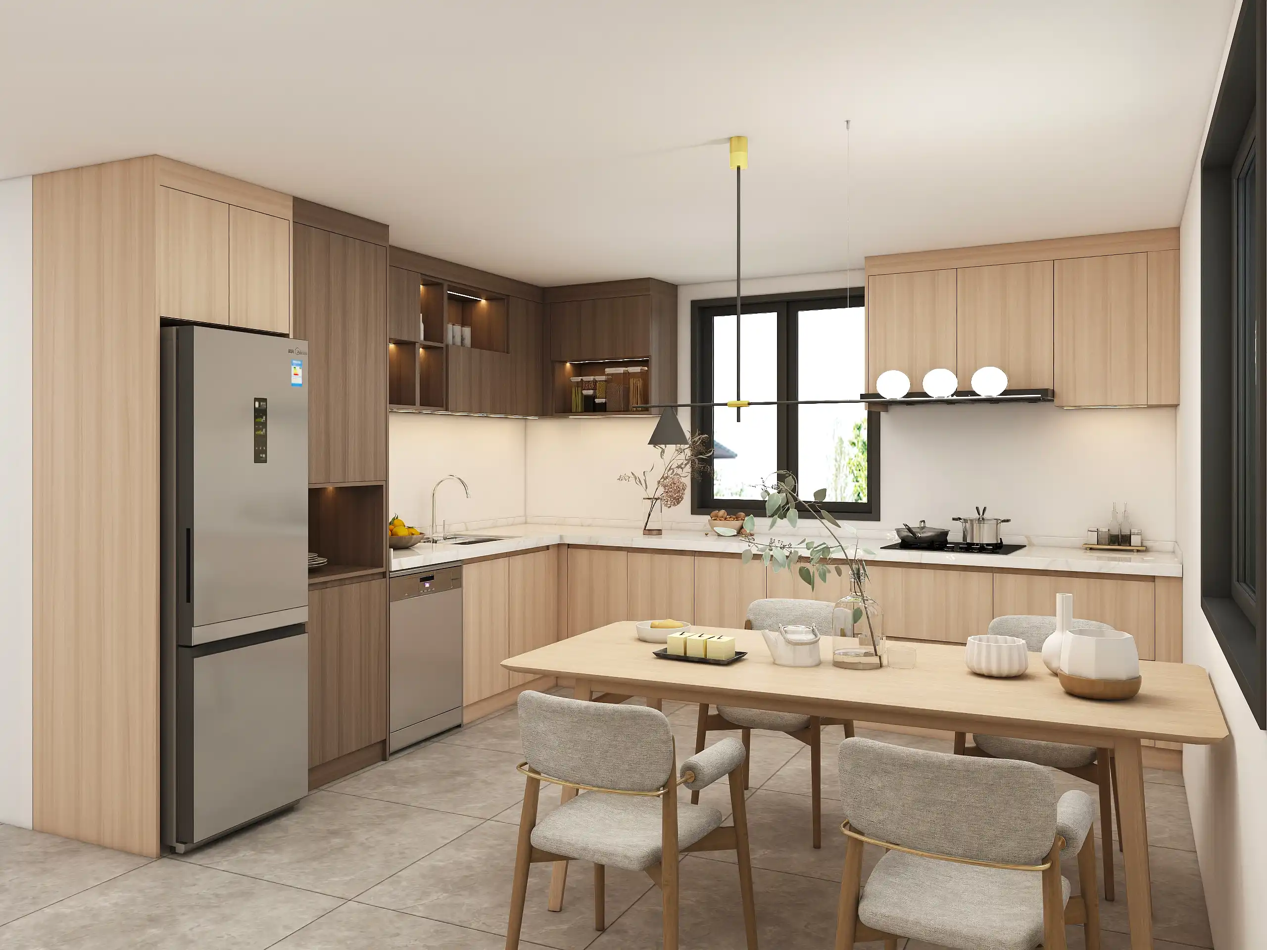
Family Island Kitchen: Mix materials like stone and oak, protected sink rail, durable finish on high-touch areas like island edges.
Pantry Wall: Book-matched veneer sequence for a calming, rhythmic look.

White Oak Alternatives (Same Vibe, Different Trade-offs)
Rift Ash: Straighter, lighter grain; great for a clean, modern look.
Birch: Subtle grain, lighter finish, often used in lower-budget projects.
Euro Oak Veneers: Consistent look and more stable; ideal for large-scale projects.
High-pressure laminates: More budget-friendly, durable, and perfect for rentals or mudrooms.
When to use each:
Rift Ash: Modern, clean aesthetic.
Birch: Budget-conscious, soft look.
Euro Oak: Large projects needing consistency.
High-pressure laminate: For low-cost, high-durability applications like bathrooms.

Spec Sheet Cheatsheet
What to include on your spec sheet
Wood type: White oak, rift or quarter-sawn.
Finish: Waterborne poly with UV inhibitors.
Grain direction: Vertical for tall doors or panels.
Edge details: Square with micro-bevel.
Door style: Slim-rail Shaker, flat slab.
Sheen: Matte or satin.
Interior box material: Plywood or MDF.
Hardware finish: Brushed nickel or matte black.
Lighting plan: Under-cabinet, ambient, task.
UV protection: Low-E glass and UV film for high-sun areas.
Include:
Sample approval under daylight + warm LEDs.
Moisture management at sink, under-cabinet seals.
Care kit included with the design.
Pain point solved: “How do I write specs so nothing gets ‘interpreted’ wrong?”
Write specs clearly, with every detail of wood type, finish, and hardware. Include photos and mockups for extra clarity.
Forget the spec sheet stress. Our 17 years of design expertise means we’ll take care of every detail, ensuring your project is both beautiful and functional for a truly enjoyable experience.
FAQ about White Oak Cabinets
Are white oak cabinets still in style?
As we look at Kitchen Trends 2025, one material is making a powerful comeback: white oak. Coveted for its welcoming tones, adaptable finishes, and enduring strength, white oak has quickly become a top choice for modern kitchen cabinetry.
Do white oak cabinets scratch easily?
White oak is one of the hardest and most durable hardwoods available. It’s highly resistant to scratches, dents, and everyday wear and tear, making it an excellent choice for high-traffic kitchen areas. Plus, its dimensional stability means it’s less likely to warp or cup over time.
Will my white oak cabinets turn yellow?
White oak is celebrated for its clean, modern, and timeless appeal. However, a common issue is that many stains and clear finishes can cause the wood to develop a yellowish or amber tint over time.
What do white oak cabinets look like?
The natural color of white oak is a creamy beige with yellow undertones, giving it a neutral yet warm feel that varies with each batch of lumber. This versatile appearance is a key reason behind its popularity.